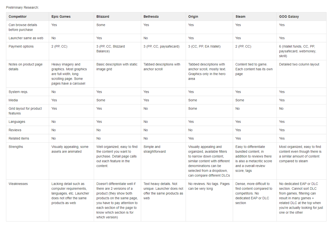
Research
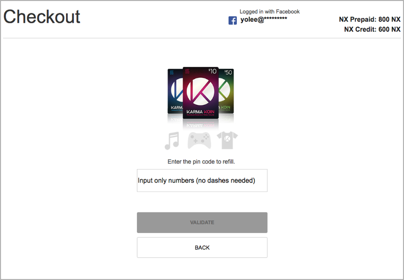
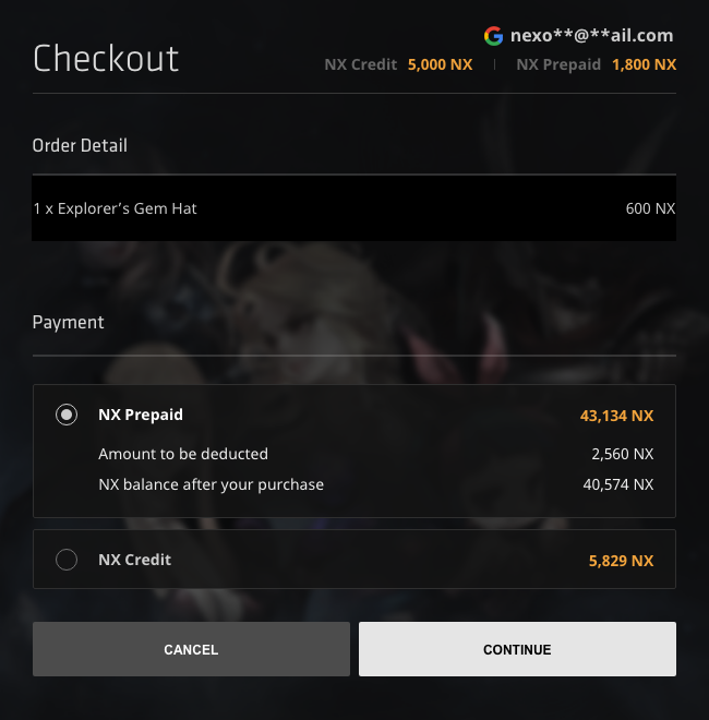
Before I started to push pixels, I needed to understand what was wrong with the old checkout and why it was scrapped. I interviewed game teams and asked what were some of the issues that they commonly experienced. It turns out that the old checkout system had backend issues and could not integrate balance information of prepaid game cards. This meant I had the opportunity to redesign it from the ground up. I started researching how other game platforms were handling their checkout and comparing it to our capabilities.
A/B Testing
After implementing the revamped pages, we gathered analytics data to see how it performed.
- We had a 55% full funnel conversion rate and 85% of users completing their transactions.
- The former data point meant that 45% of users ended up choosing not to purchase an item, but of the majority who decided to make a purchase, only 15% did not complete the checkout process.
- 90% of users who encountered a problem were able to complete a transaction.
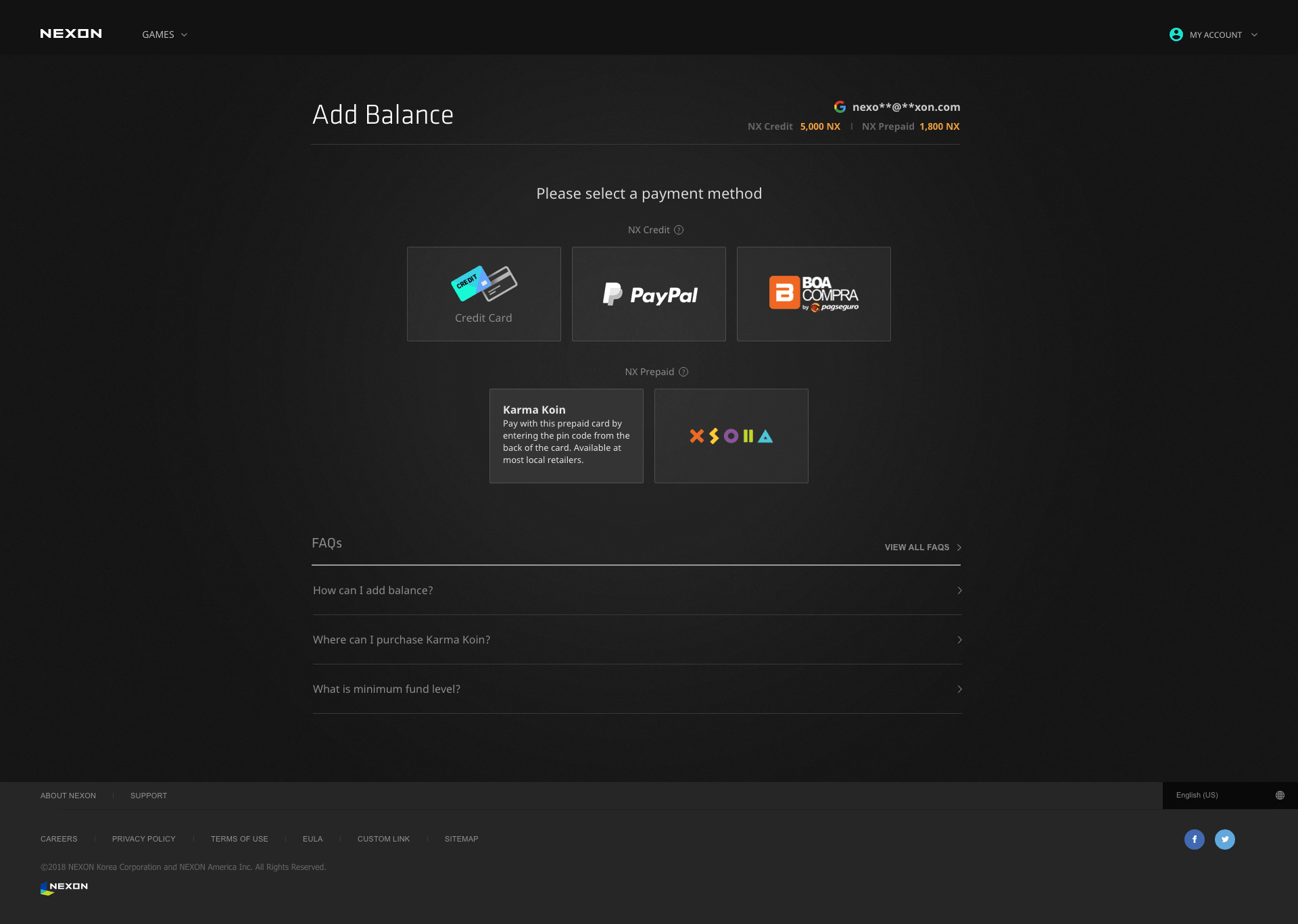
This was good news, but we wanted to dig deeper into the data to understand the usage for each payment method. To better understand if users were trying to learn more about payment gateways, we looked at the data for users who looked at an FAQ.
- 7.87% of users click an FAQ
- 51.96% transaction completion rate for users clicking on an FAQ
- 57.14% transaction completion rate for users NOT clicking on an FAQ
- 5% of repeat FAQ clicks (more than once) in the same session
I hypothesized that we could add short messages on our payment gateway buttons to give a context to users on what forms of payment methods are accepted on the payment gateway so that they would rely on the FAQs less. If users relied on FAQs less, then there would be a lesser chance of them contacting customer service.
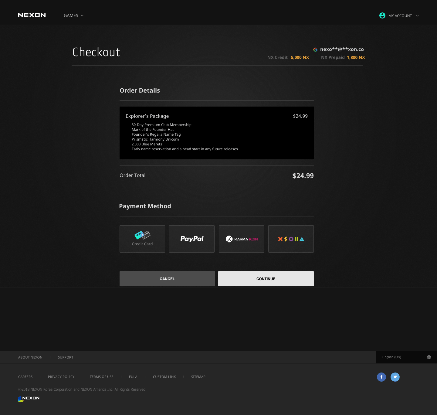
We conduct an A/B test with three variants:
- Variant A - The current version, which was buttons without supplemental text
- Variant B - buttons with supplemental text below the buttons
- Variant C - buttons with supplemental text on hover
Contrary to our hypothesis, variant A performed the best as shown in the results below. I hypothesize that this could be due to the amount of time it takes users to read each description and possibly cause them to change their mind. The new checkout also eliminated the tickets that came in about users' game crashing because they were now able to checkout while playing the game.