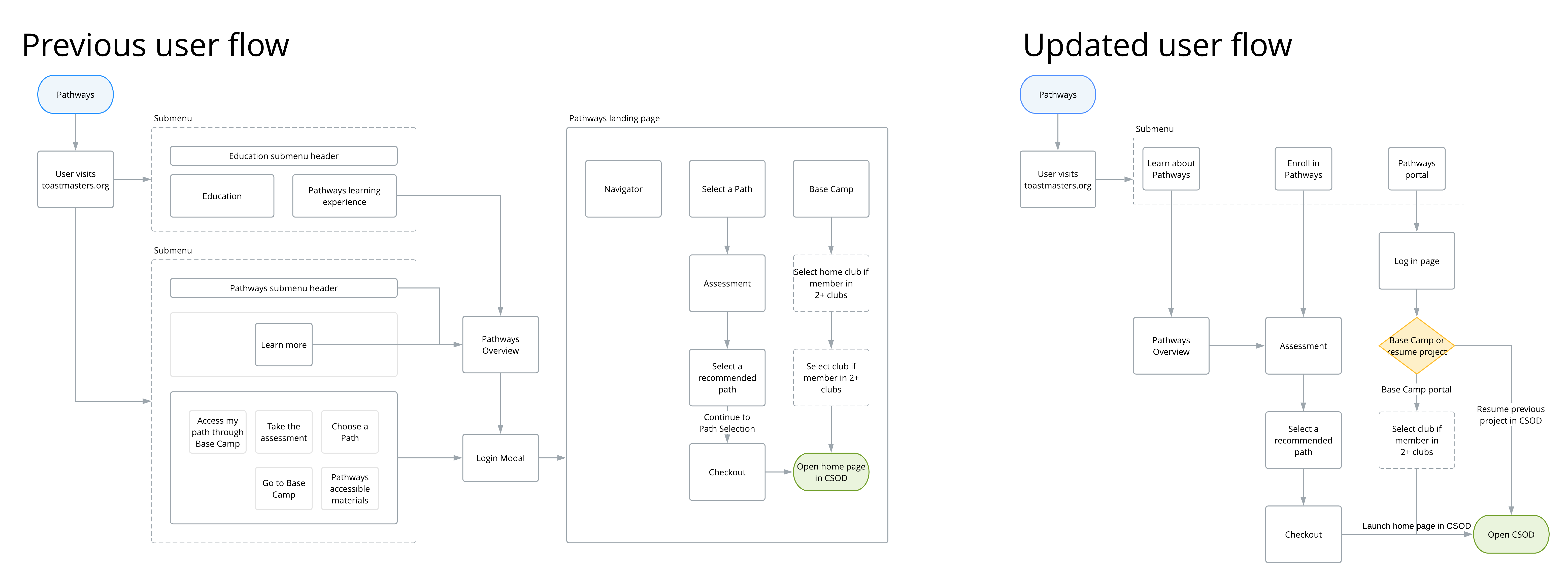
Previous onboarding process
With over 345,000 Toastmasters members from around the world, Toastmasters' goal is to continue as the leading organization who people turn to develop their communication and leadership skills. We recently revamped our paper-based education program to a digital medium called Pathways, to replace the current education program. In Pathways, members take our assessment, and we recommend three out of ten of the best-matched education paths to them based on how they answered. Early adopters found tremendous benefits from the new program, but it also has its flaws.
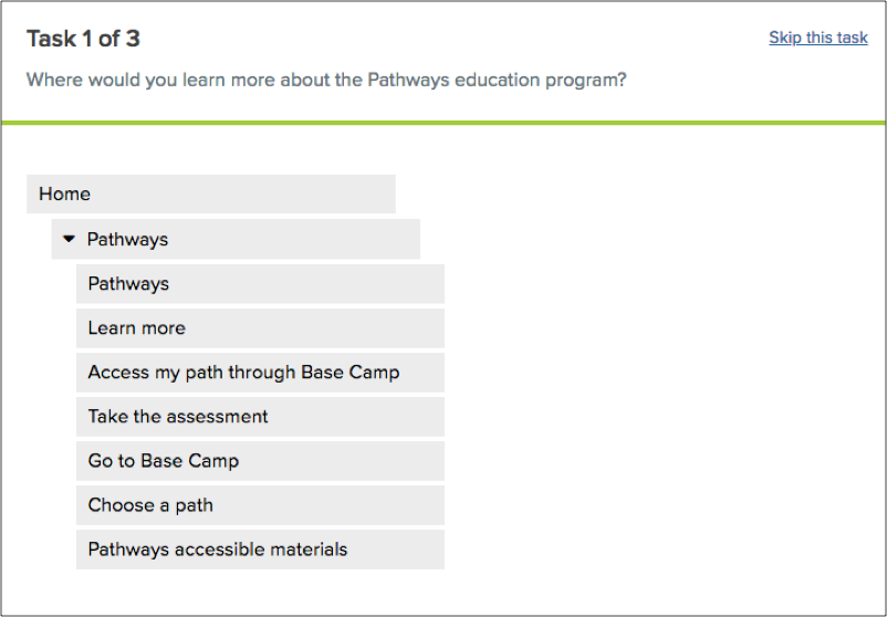
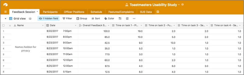
Since Pathways rolled out in phases, many regions did not have access until later in the year. The phased rollout gave us an opportunity to iterate on the design before it reached a broader audience. A few members had already voiced their concerns to our customer service representatives, but testing with users would give us futher validation. I conducted a usability test, tree test, and user interviews with eight early adopters to determine their pain points and find areas for improvement.
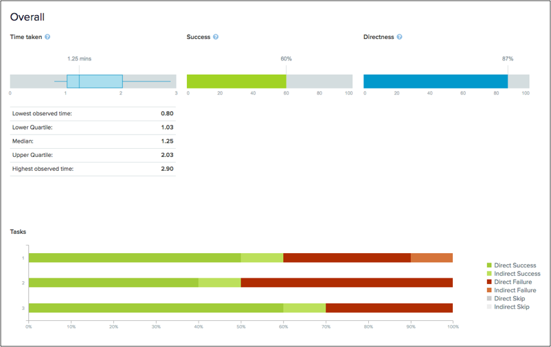
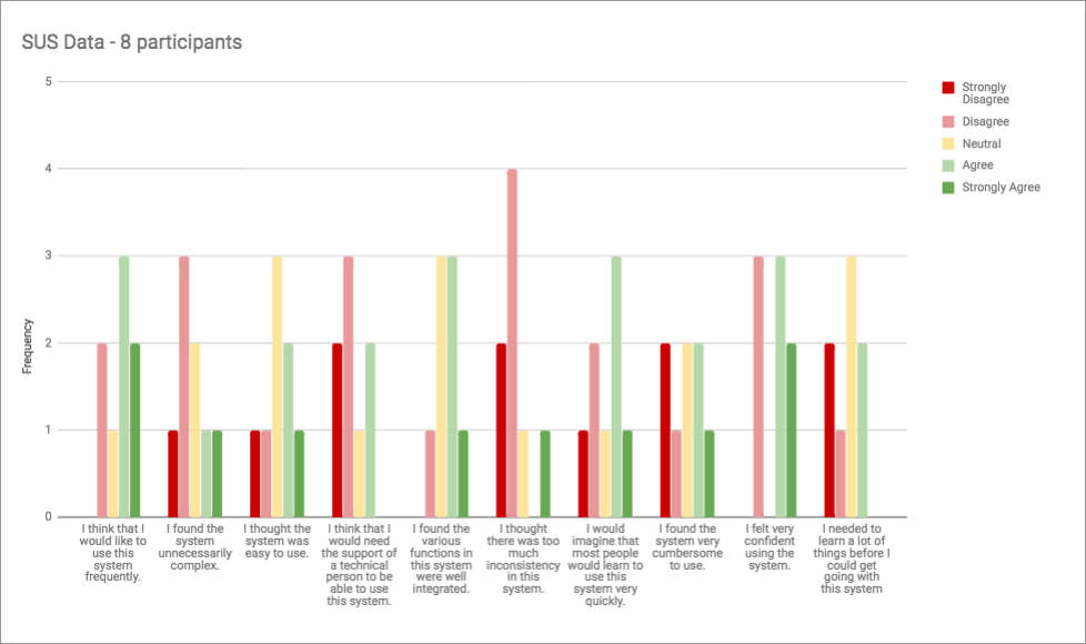
The usability test also included a System Usability Scale (SUS) to measure perceptions of usability. The average score is 68th percentile. Anything lower means that we should look into areas of the product that caused the score to drop. While we scored in the 60th percentile, I knew exactly where the issues were. Many participants were vocal about how difficult it was for a returning user to access Pathways. This was due to the phased rollout and the product would not be available for 90% of the members in the first three months of launch. It had already been planned that once the product was rolled out to more regions, adding quick access links on the homepage would alleviate the majority of the concerns. The tests raised a few concerns:
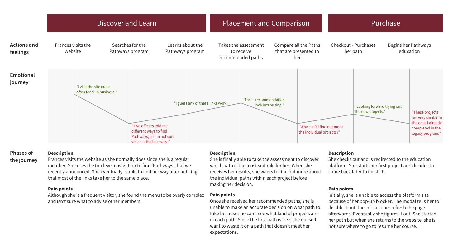
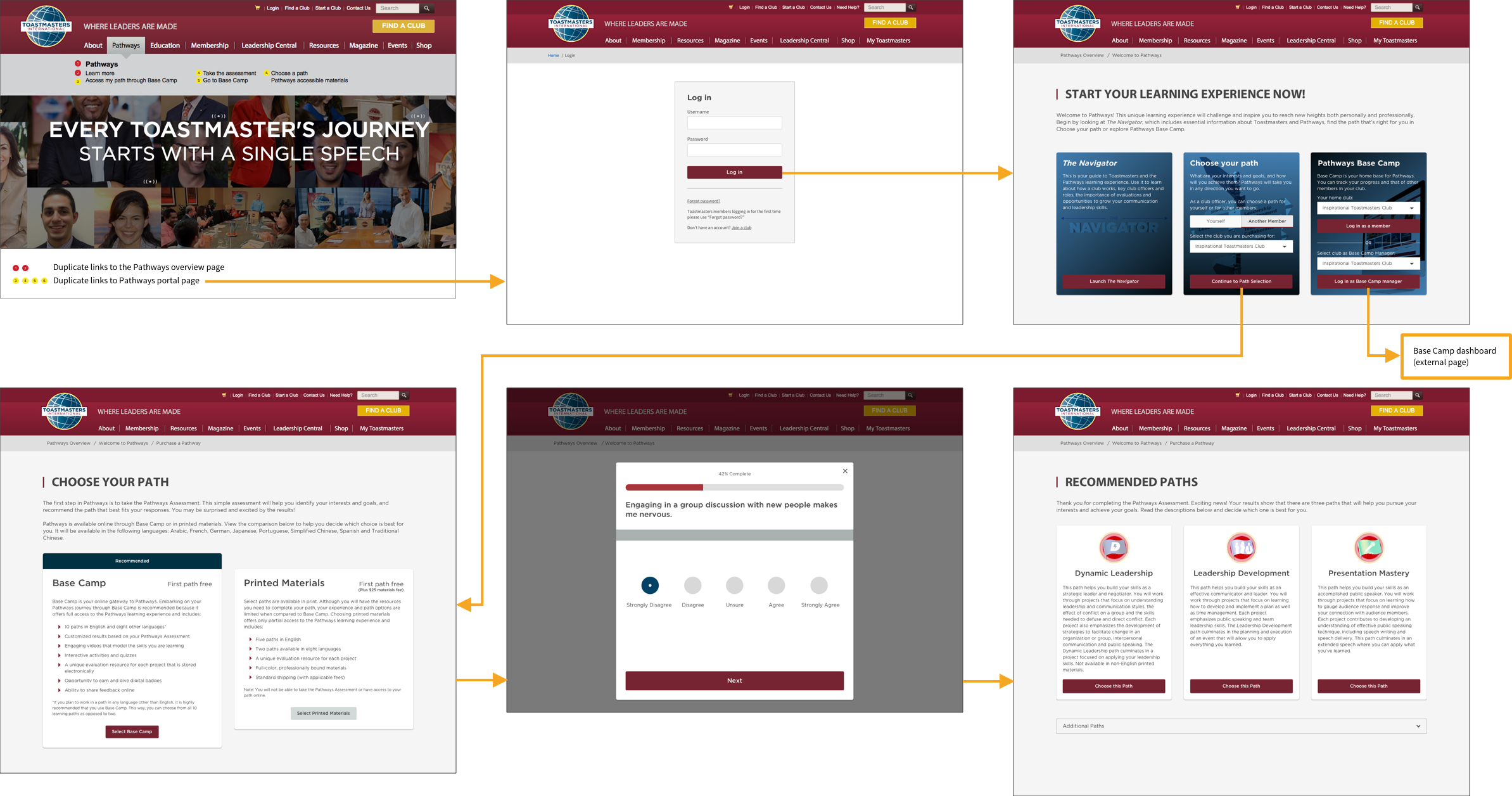
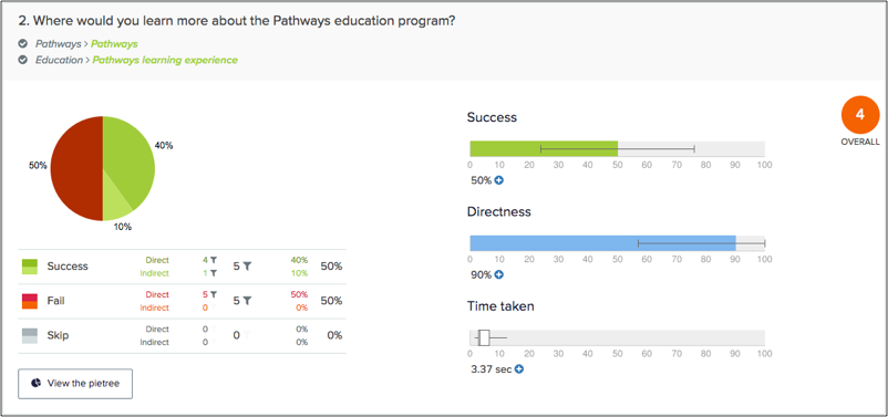
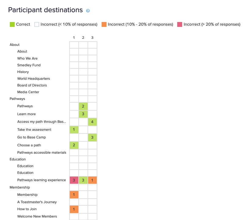
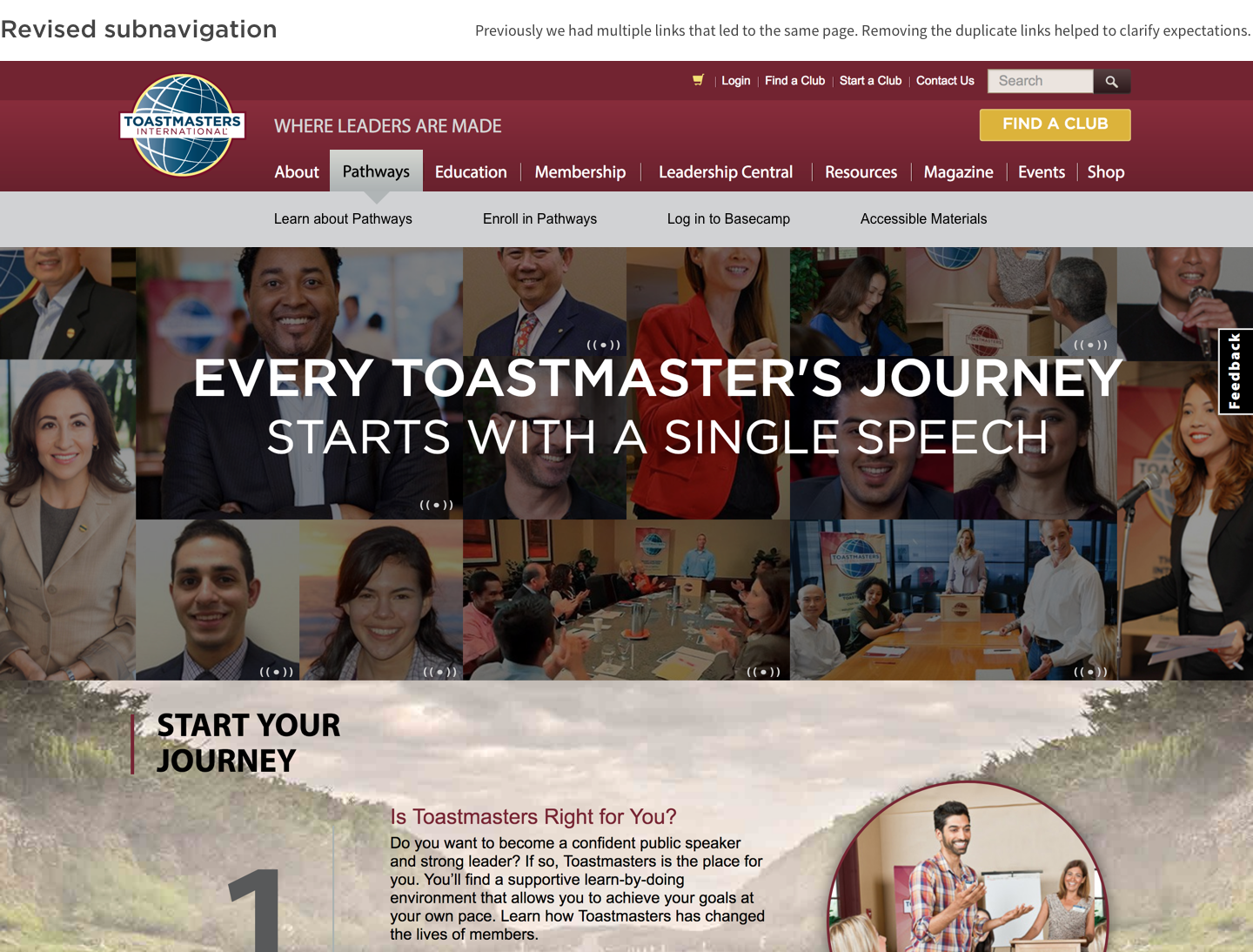
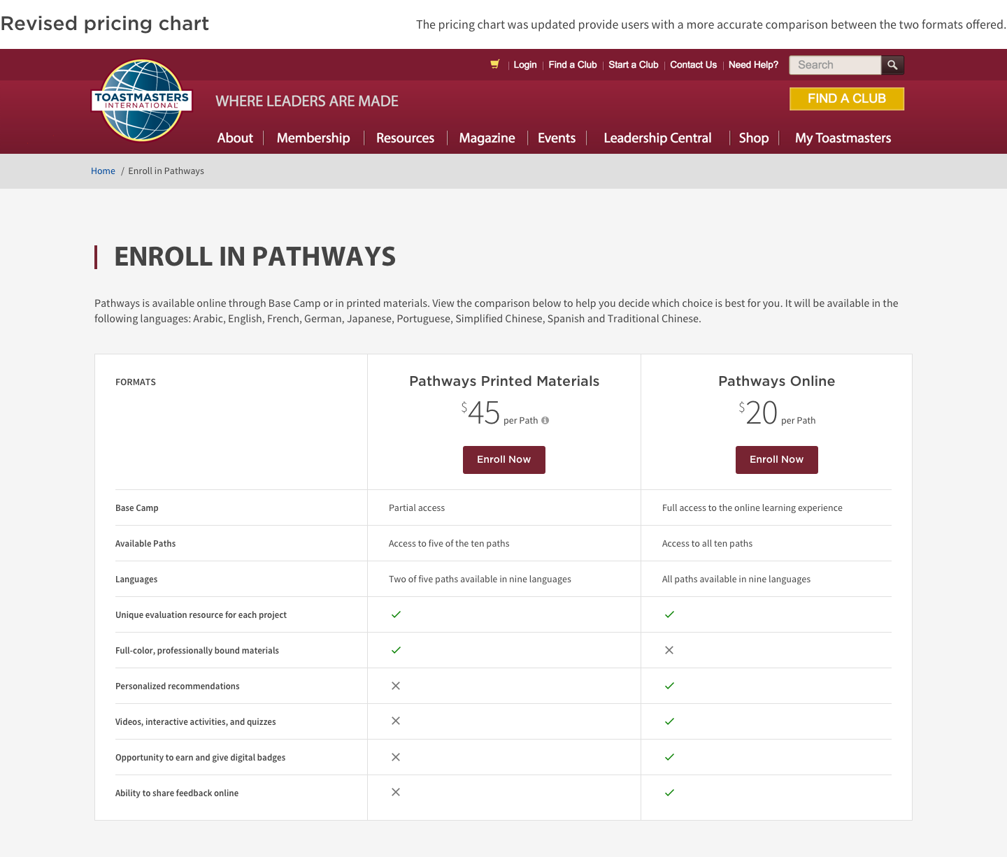
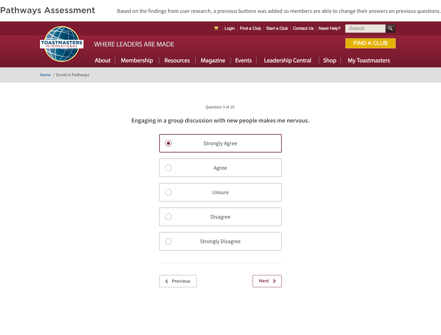
Based on my usability test, it was clear that the Pathways enrollment page was difficult to find. There were duplicate links under the main navigation that took users to the same page, while the most important links were deeply hidden.
We offered the first education path for free, but also failed to mention the price of the subsequent path. Therefore, most members were shocked to see the regular price.
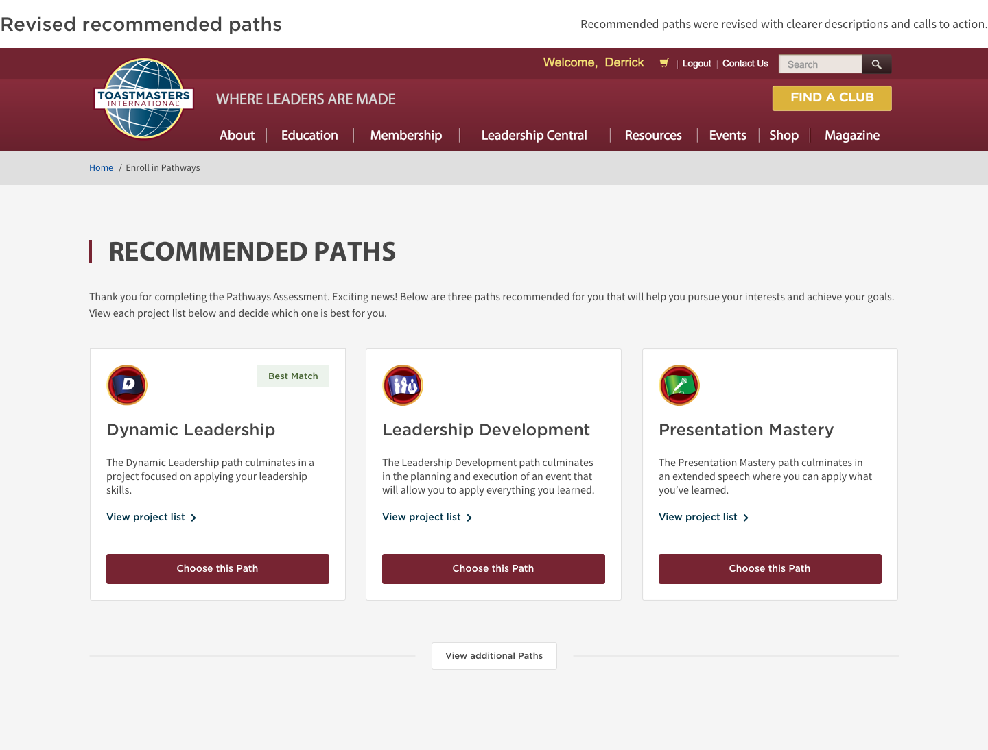
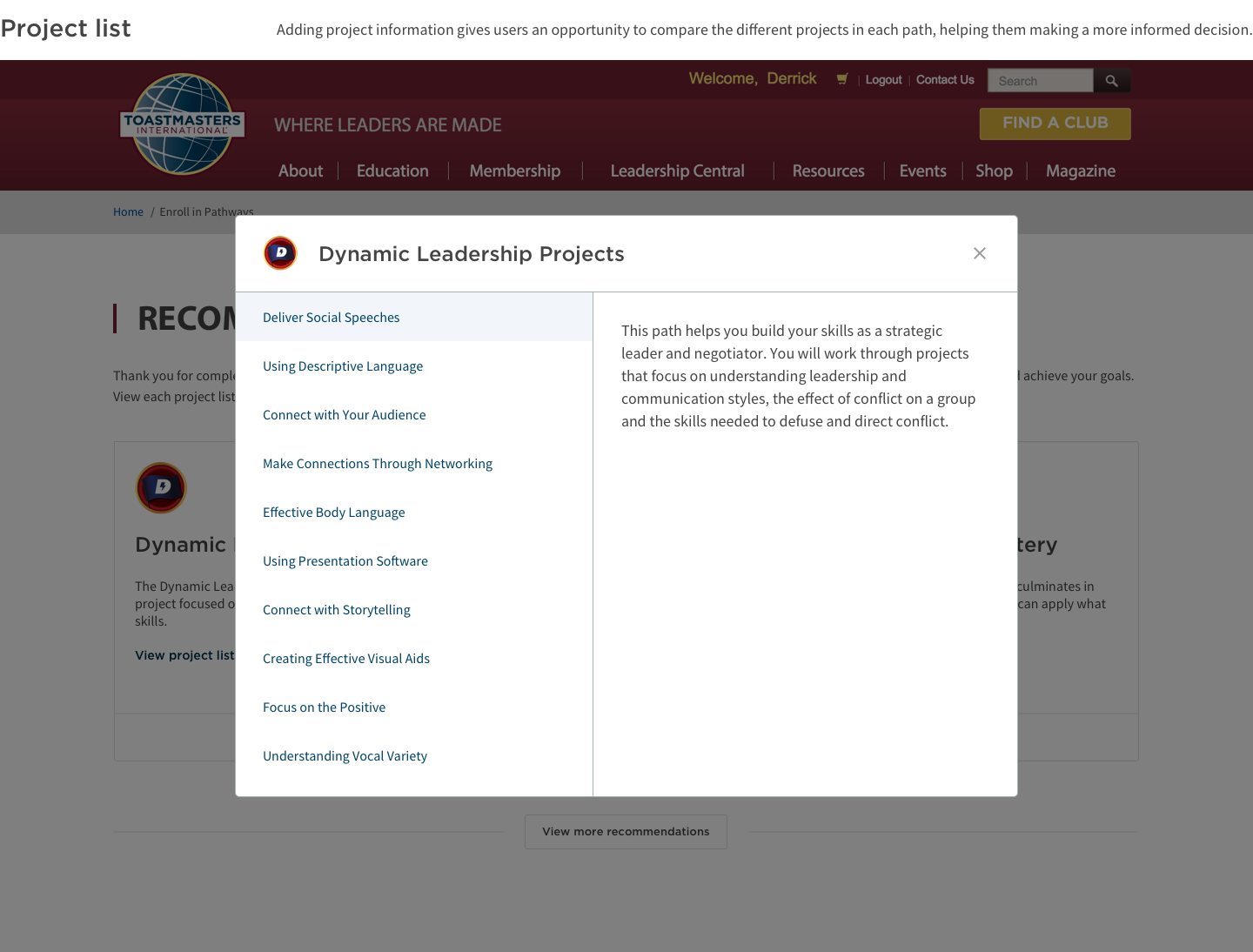
The recommended paths lacked clarity because members didn't know what kind of projects were in them. There was hesitation on deciding which path to enroll in because they had limited information to compare to.
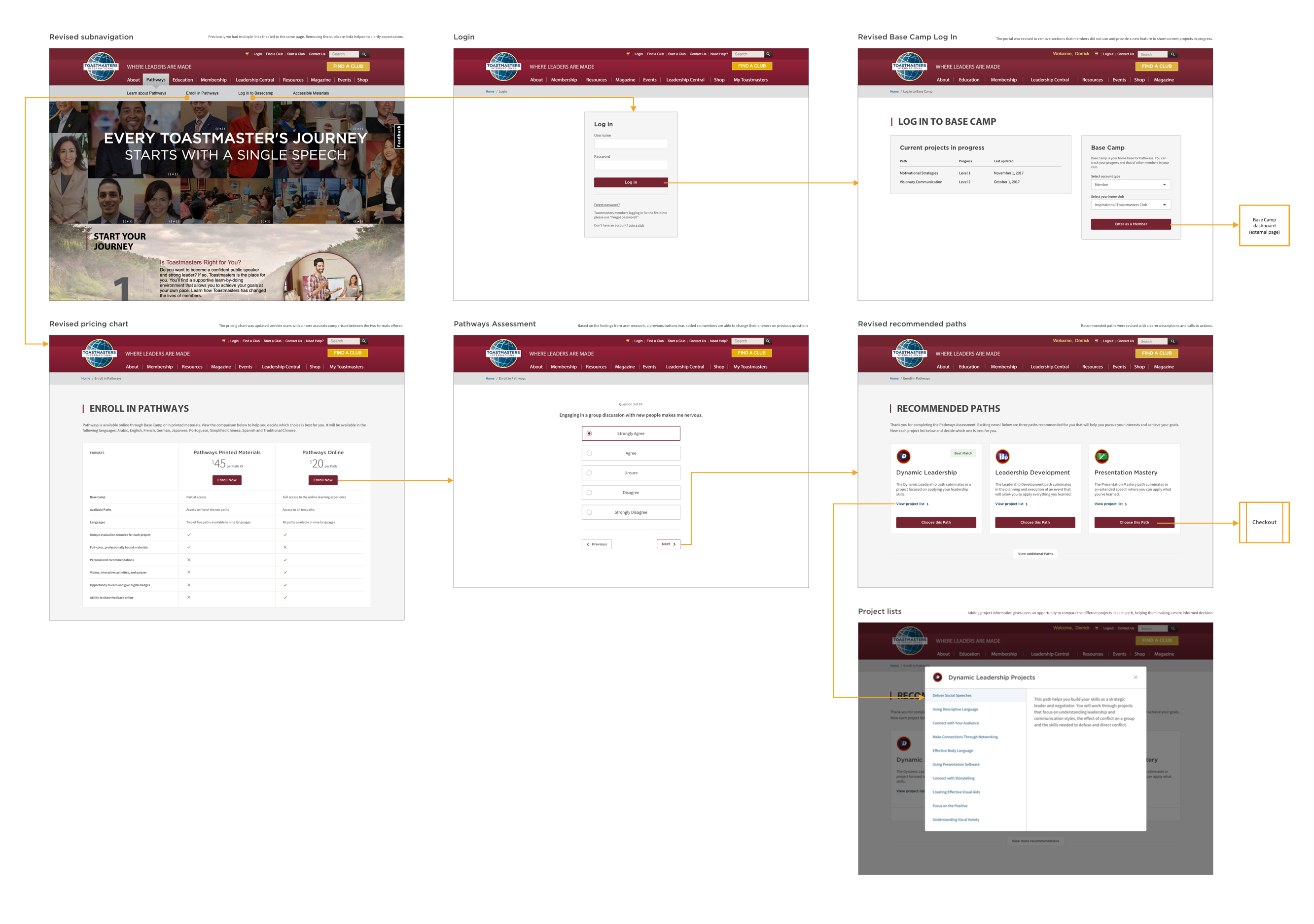
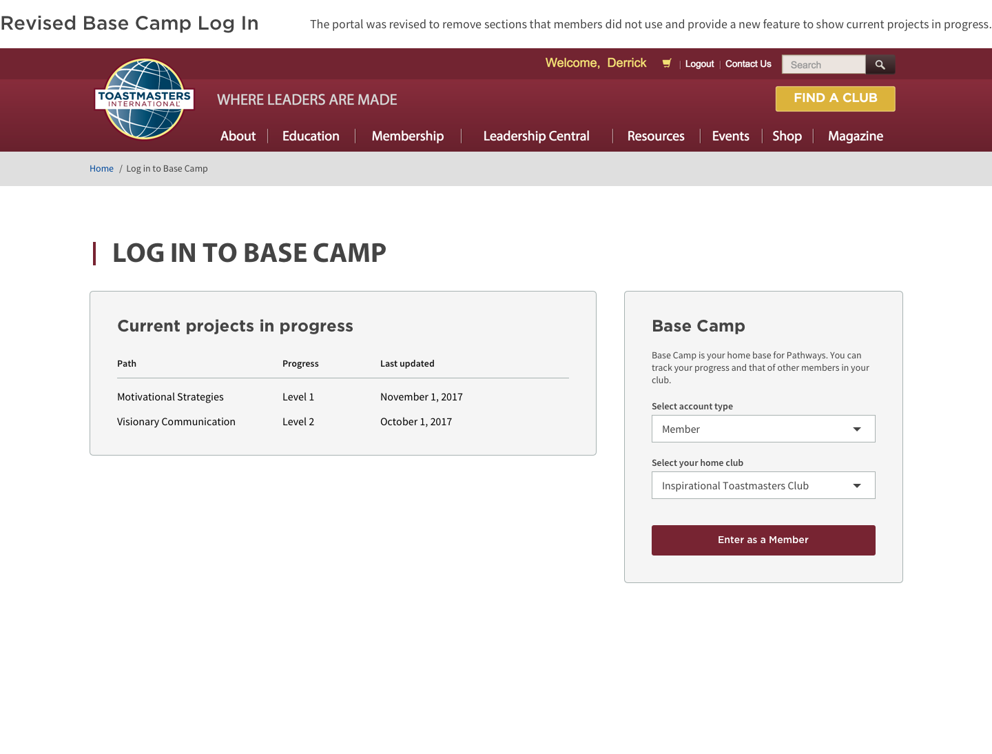
With the results from my research, along with feedback from stakeholders and early adopters, I was able to formulate a solution to improve both user experience and target goals. The first thing I did was to address the issues causing the most problems, which were the links in the submenu. The main navigation is now updated with only the links to direct users towards the 3 main areas of Pathways: learning, enrolling, and the portal. The previous navigation had 10 links of which more than half were duplicate links.
The pricing page was also revised to give a clearer comparison between purchasing print and online. Another primary concern was the lack of detail on what the recommendations meant after users took the assessment. The path descriptions were often left for members to interpret on their own while most wanted to know what projects were contained in them. By adding a project list, users can accurately gauge the path with the projects best fit for them.
By being more transparent and direct in our navigation schema, members were able to make a more informed purchase decision. We launched a new campaign to brief members on the features and differences to ease the transition process. We continued to provide the paper-based version of the education program alongside the digital version to give members both options. After two months, we achieved the following results: